Portfolio: Public Works
Washington’s Public Works program tracks and manages public money, and sets the prevailing wage rates for state contractors.
For this project, the department wanted a proof of concept for an improved lookup tool that searches prevailing wage rates and documentation for public works projects.
Search and Results Pages
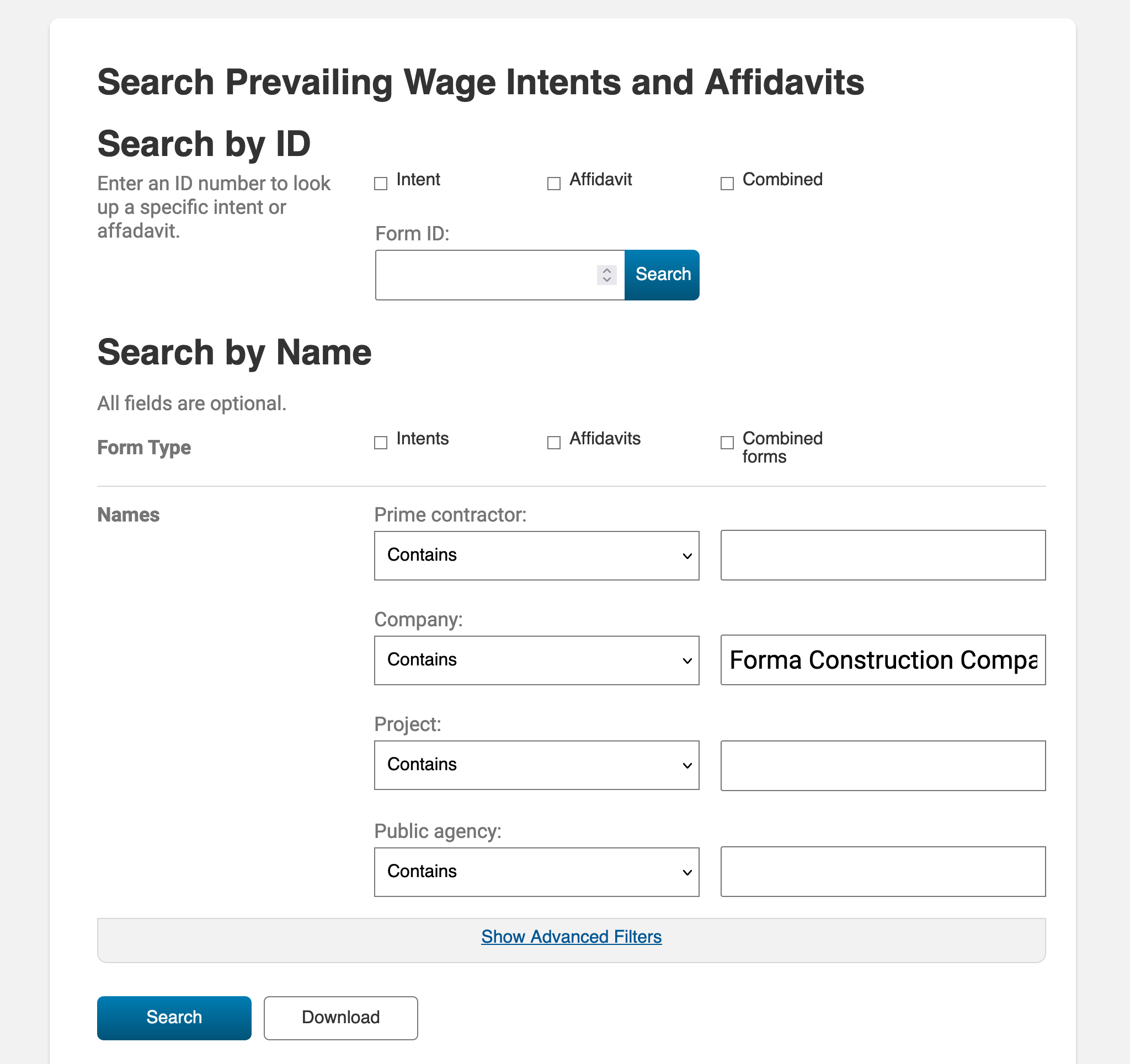
The biggest challenge with this part of the project was organizing the considerable amount of data that came along with it. Over 20 input fields made up the search tool, making search filtering granular, but daunting to use. Furthermore, there were actually two different search tools on the same page, but the distinction between them was easy to miss.
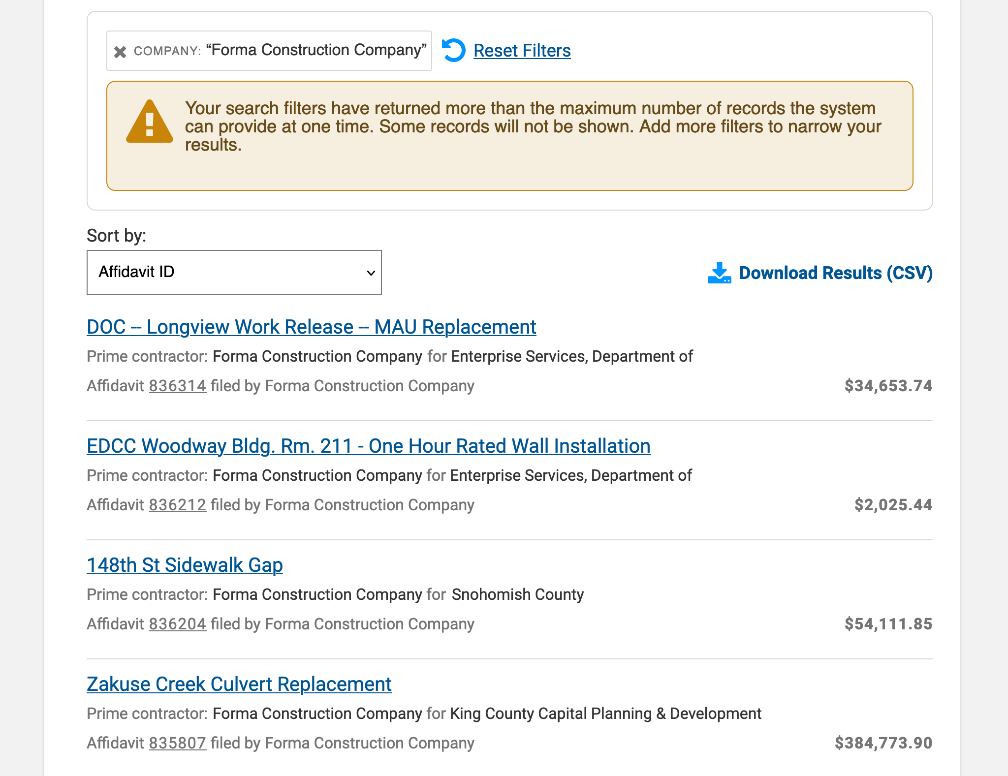
The search results themselves were poorly organized in a sprawling table format that was not easy to use on mobile devices, and the project detail page was laid out with inelegant and repetitive key-value pairs.
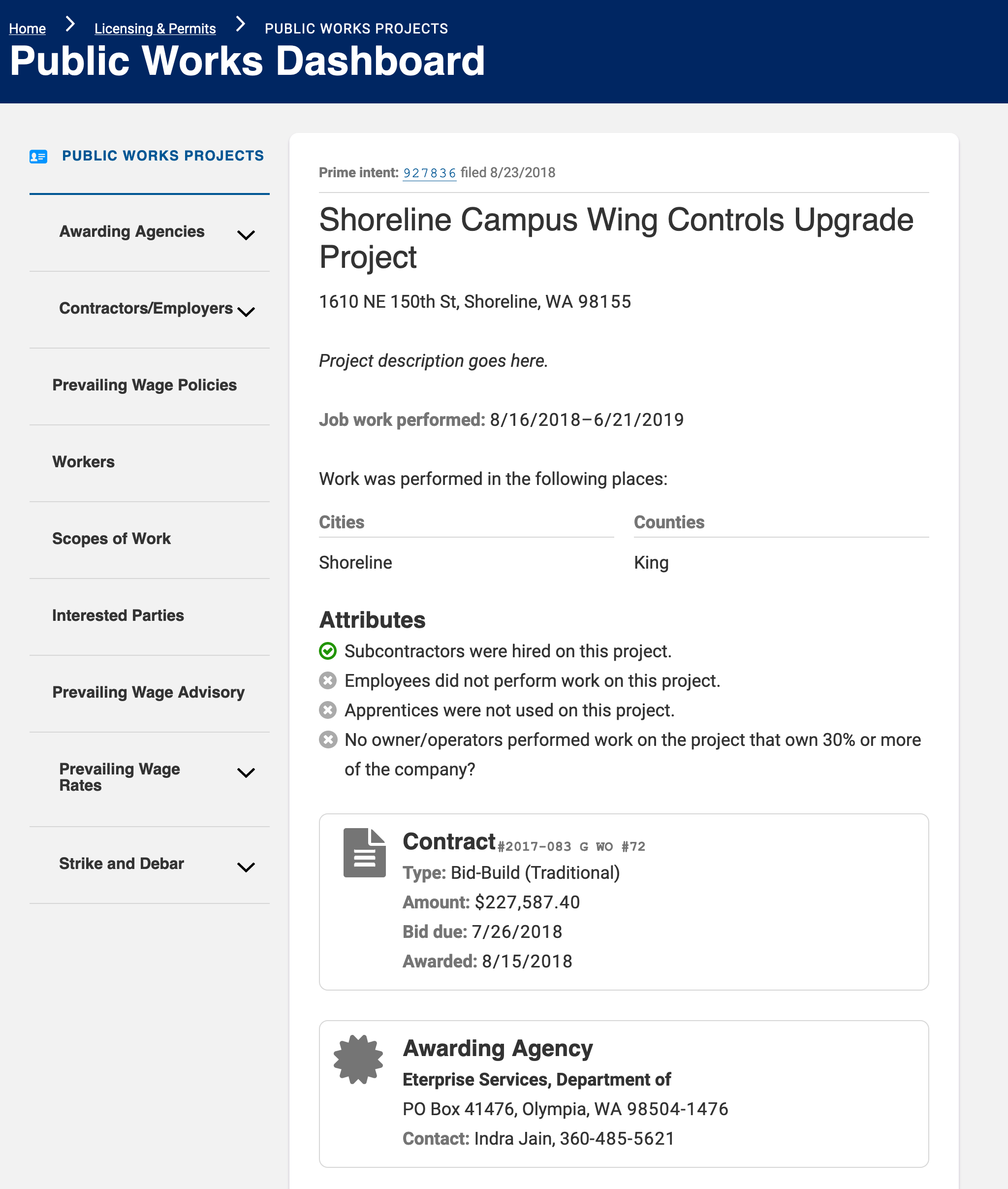
Puzzling through a project’s structure required the user to tediously cross-reference IDs and manually match them to contractors on the project. Not intuitive.
Puzzling through a public works project’s structure required the user to tediously cross-reference IDs and manually match them to contractors. Not intuitive.
Streamlining the Options
To redesign the search page itself, I interviewed stakeholders and discovered the fields people were most likely to use. From there, I created a more streamlined experience by hiding most of the unpopular text inputs behind an “advanced search” widget.
Next I tackled the search results, breaking down the table into more of a Google-style results format. The biggest benefits to the new layout are that it’s easier to process, and the results are responsive and can more naturally size down to fit a mobile context.
The project’s title doesn’t need to say “Project Title” in front of it, it just has to look like a project title. People will understand.
After that, I redesigned the project’s landing page when someone chooses one of the results. My intent here was to take the page out of “database mode” where every bit of data is presented with a key and a value, and instead I used design principles to create a natural context. For example, the project title doesn’t need to have the words “Project Title” in front of it, it just has to look like the project title. People will understand.
Another way to increase context was to use icons. For contractor statuses, I used stop and go “lights” to communicate statuses. This allows users to easily see at a glance which contractors are legally allowed to work on a project.
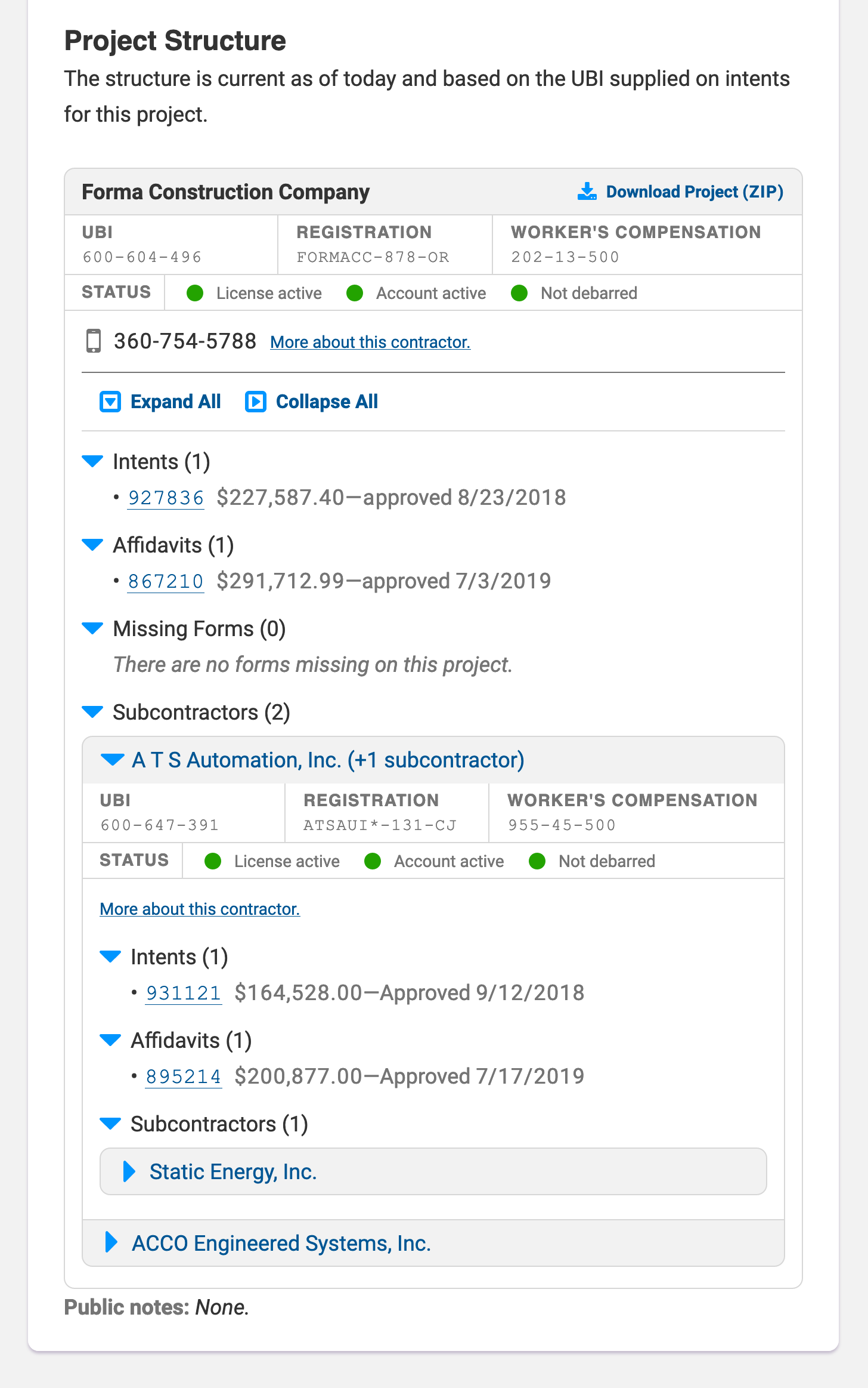
I also took the project structure section and broke it out of its table and matched it to a more robust internal tool. No more cross-referencing is necessary; simply expand the boxes to see which subcontractors were hired by which parties.
Wage Lookup Tool
Another part of the project was to redesign Washington’s public wage lookup tool.
The biggest issue with the original design was the use of multi-select form fields. In testing, the vast majority of users didn’t understand how these inputs work, so I used a dropdown pattern with checkboxes instead. This makes it much more evident how to select multiple counties or trades by which to filter.
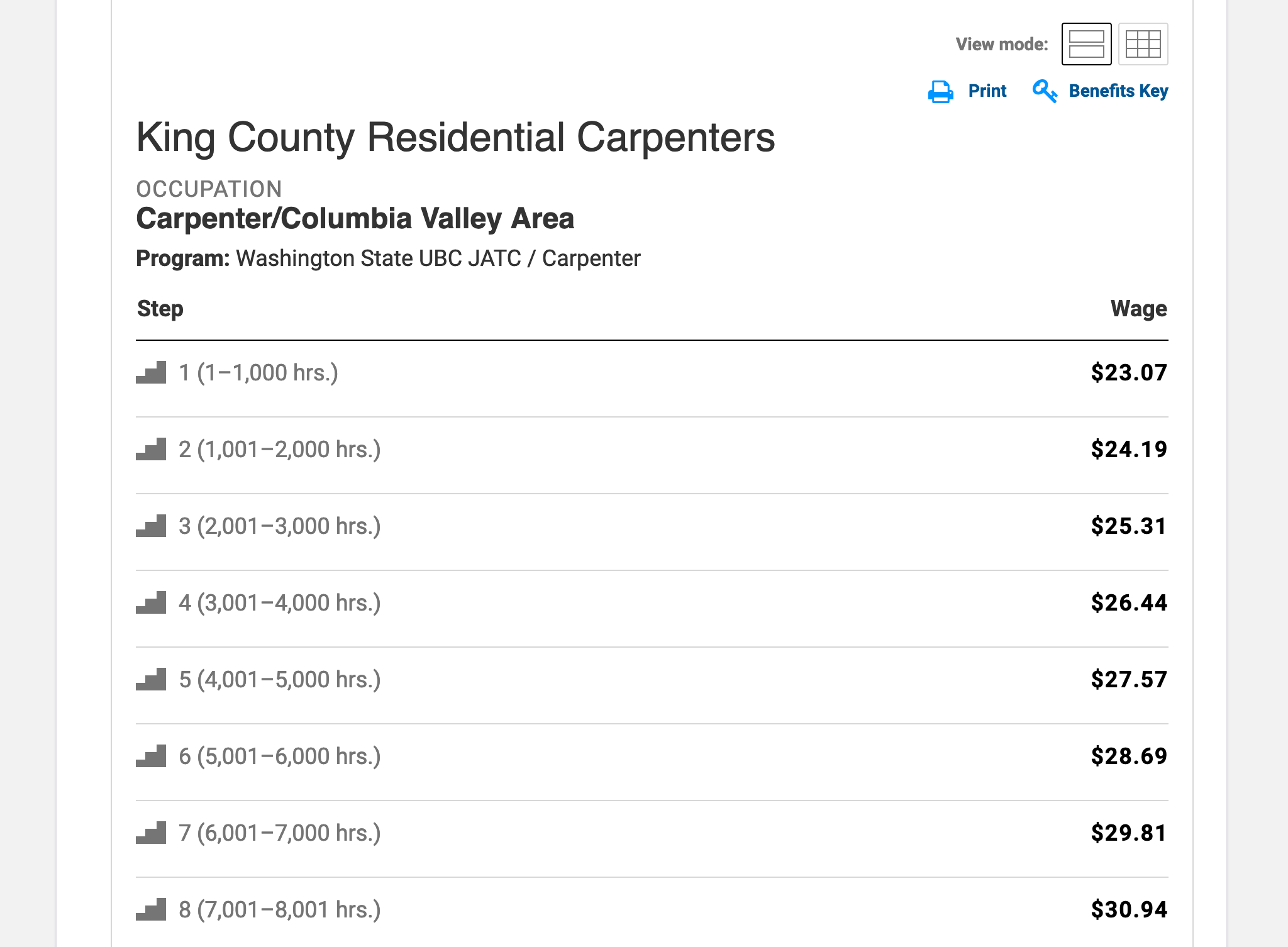
Once again, search results were populated in a tabular format, and I redesigned it to make the tool responsive and usable on mobile devices. Not only that, because the whole point of this tool is to look up wage rates, I emphasized those rates in the results, making them unmistakeable.
Another strange quirk of the original design is that switching between the apprentice wages and journey-level wages was through a small link that looked like it was part of the lookup tool. I addressed this issue by building the new tool in a tabbed format, making it more obvious which tool you were on, and how to switch between the two.
Because the whole point of this tool is to look up wage rates, I emphasized those rates in the results, making them unmistakable.
I used this prototype to run usability studies, comparing them to the existing website's results, and found that users completed most tasks more easily than before. With some some additional improvements, stakeholders had the confidence to move forward with the application. In 2022, the project team submitted their funding request to have the tool developed.
Are you in need of design or development work? I’m available for hire! Send me an email and let’s talk.